New features on Simply Statistics
18 Dec 2011Check out our Editor’s Picks and Interviews pages.
 Follow us on twitter @simplystats
In a recent post I described the importance of government statisticians. Well, apparently in Greece it is a dangerous job, as Andreas Georgiou, the person in charge of the Greek statistics office, found out.
So far, though, his efforts have been met with resistance, strikes and a criminal investigation that could lead to life in prison for Georgiou.
What are his efforts ?
His first priority after he was appointed was to figure out how big Greece’s deficit really was back in 2009, when the crisis began. He looked through all the data and concluded that Greece’s deficit that year was 15.8 percent of GDP — higher what had previously been reported.
Eurostat, the central authority in Brussels, praised Georgiou’s methodology and blessed the number as true. The hundreds of Greek people who work beneath Georgiou — the old guard — did not.
So in response, the “old guard” decided to vote on the summary statistic:
Skordas sits on a governing board for the statistics office. His board wanted to debate and vote on the deficit number before anyone in Brussels was allowed to see it. Georgiou, the technocrat, saw that as a threat to his independence. He refused. The number is the number, he said. It’s not something to be put up for a vote.
Did they perform a Bayesian analysis based on the vote?

Statistician. I feel like statisticians can call them data scientists, but not the other way around. Although with data scientists there’s an implied knowledge of programming, which statisticians need to get better at.
I’m visualization-focused, and I really got into the area during a summer internship at The New York Times. Before that, I mostly made graphs in R for reports. I learned a lot about telling stories with data and presenting data to a general audience, and that has stuck with me ever since.
Similarly, my adviser Mark Hansen has showed me how data is more free-flowing and intertwined with everything. It’s hard to describe. I mean coming into graduate school, I thought in terms of datasets and databases, but now I see it as something more organic. I think that helps me see what the data is about more clearly.
I got into visualization during my first year in grad school. My adviser gave a presentation on visualization, but from a media arts perspective rather than a charts-and-graphs-in-R-Tufte point of view. I went home after that class, googled visualization and that was that.
The Web is a really visual place, so it’s easy for good visualization to spread. It’s also easier for a general audience to read a graph than it is to understand statistical concepts. And from a more analytical point of view, there’s just a growing amount of data and visualization is a good way to poke around.
For static graphics, I use Illustrator all the time to bring storytelling into the mix or to just provide some polish. For interactive graphics on the Web, it’s all about JavaScript nowadays. D3, Raphael.js, and Processing.js are all good libraries to get started.
<div class="im">
<strong>How did you decide to write your book “Visualize This”?</strong>
</div>
<div class="im">
</div>
<div class="im">
Pretty simple. I get emails and comments all the time when I post graphics on FlowingData that ask how something was done. There aren’t many resources that show people how to do that. There are books that describe what makes good graphics but don’t say anything about how to actually go about doing it, and there are programming books for say, R, but are too technical for most and aren’t visualization-centric. I wanted to write a book that I wish I had in the early days.
</div>
<div class="im">
<strong>Any final thoughts on statistics, data and visualization? </strong>
</div>
<div class="im">
<strong><br /></strong>Keep an open mind. Oftentimes, statisticians seem to box themselves into positions of analysis and reports. Statistics is an applied field though, and now more than ever, there are opportunities to work anywhere there is data, which is practically everywhere.
</div>
The review times for most journals in our field are ridiculous. Check out Figure 1 here. A careful review takes time, but not six months. Let’s be honest, those papers are sitting on desks for the great majority of those six months. But here is what really kills me: waiting six months for a review basically saying the paper is not of sufficient interest to the readership of the journal. That decision you can come to in half a day. If you don’t have time, don’t accept the responsibility to review a paper.
I like sharing my work with my statistician colleagues, but the Biology journals never do this to me. When my paper is not of sufficient interest, these journals reject me in days not months. I sometimes work on topics that are fast pace and many of my competitors are not statisticians. If I have to wait six months for each rejection, I can’t compete. By the time the top three applied statistics journals reject the paper, more than a year goes by and the paper is no longer novel. Meanwhile I can go through Nature Methods, Genome Research, and Bioinformatics in less than 3 months.
Nick Jewell once shared an idea that I really liked. It goes something like this. Journals in our field will accept every paper that is correct. The editorial board, with the help of referees, assigns each paper into one of five categories A, B, C, D, E based on novelty, importance, etc… If you don’t like the category you are assigned, you can try your luck elsewhere. But before you go, note that the paper’s category can improve after publication based on readership feedback. While we wait for this idea to get implemented, I please ask that if you get one of my papers and you don’t like it, reject it quickly. You can write this review: “This paper rubbed me the wrong way and I heard you like being rejected fast so that’s all I am going to say.” Your comments and critiques are valuable, but not worth the six month wait.
ps - I have to admit that the newer journals have not been bad to me in this regard. Unfortunately, for the sake of my students/postdocs going into the job market and my untenured jr colleagues, I feel I have to try the established top journals first as they still impress more on a CV.
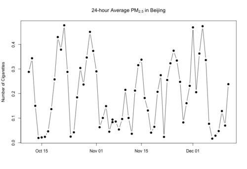
Over the last week or so I’ve been posting about the air pollution levels in Beijing, China. The twitter feed from the US Embassy there makes it easy to track the hourly levels of fine particulate matter (PM2.5) and you can use this R code to make a graph of the data.
One problem with talking about particulate matter levels is that the units are a bit abstract. We usually talk in terms of micrograms per cubic meter (mcg/m^3), which is a certain mass of particles per volume of air. The 24-hour national ambient air quality standard for fine PM in the US is 35 mcg/m^3. But what does that mean in reality?
C. Arden Pope III and colleagues recently wrote an interesting paper in Environmental Health Perspectives on the dose-response relationship between particles and lung cancer and cardiovascular disease. They combined data from air pollution studies and smoking studies to estimate the dose-response curve for a very large range of PM levels. Ambient air pollution, not surprisingly, is on the low-end of PM exposure, followed by second hand smoke, followed by active smoking. One challenge they faced is putting everything on the same scale in terms of PM exposure so that the different studies could be compared.
Here are the important details: On average, actively smoking a cigarette generates a dose of about 12 milligrams (mg) of particulate matter. Daily inhalation rates obviously depend on your size, age, physical activity, health, and other factors, but in adults they range from about 13 to 23 cubic meters of air per day. For convenience, I’ll just take the midpoint of that range, which is 18 cubic meters per day.
If your city’s fine PM levels were compliant with the US national standard of 35 mcg/m^3, then in the worst case scenario you’d be breathing in about 630 micrograms of particles per day, which is about 0.05 cigarettes (1 cigarette every 20 days). Sounds like it’s not too bad, but keep in mind that most of the increase in risk from smoking is seen in the low range of the dose-response curve (although this is obviously very low).
If we move now to Beijing, where 24-hour average levels can easily reach up to 300 mcg/m^3 (and indoor levels can reach 200 mcg/m^3), then we’re talking about a daily dose of almost half a cigarette. Now, half a cigarette might still seem like not that much, but keep in mind that pretty much everyone is exposed: old and young, sick and healthy_._ Not everyone gets the same dose because of variation in inhalation rates, but even the low end of the range gives you about 0.3 cigarettes.
Beijing is hardly alone here, as a number of studies in Asian cities show comparable levels of fine PM. I’ve redone my previous plot of PM2.5 in Beijing in terms of number cigarettes per day. Here’s the last 2 months in Beijing (for an average adult).