 Follow us on twitter
 Interview with Amanda Cox - Graphics Editor at the New York Times
01 Jun 2012
Amanda Cox received her M.S. in statistics from the University of Washington in 2005. She then moved to the New York Times, where she is a graphics editor. She, and the graphics team at the New York Times, are responsible for many of the cool, informative, and interactive graphics produced by the Times. For example, this, this and this (the last one, Olympic Symphony, is one of my all time favorites).
In the middle of my first year of grad school (in statistics at the University of Washington), I started applying for random things. One of them was to be a summer intern in the graphics department at the Times.
How are the graphics and charts you develop different than producing graphs for a quantitative/scientific audience?
How do you use R to prototype graphics?
I sketch in R, which mostly just means reading data, and trying on different forms or subsets or levels of aggregation. It’s nothing fancy: usually just points and lines and text from base graphics. For print, I will sometimes clean up a pdf of R output in Illustrator. You can see some of that in practice at chartsnthings.tumblr.com, which where one of my colleagues, Kevin Quealy, posts some of the department’s sketches. (Kevin and I are the only regular R users here, so the amount of R used on chartsnthings is not at all representative of NYT graphics as a whole.)
Do you have any examples where the R version and the eventual final web version are nearly identical?
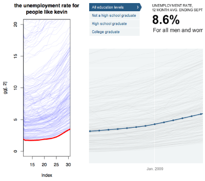
Real interactivity changes things, so my use of R for web graphics is mostly just a proof-of-concept thing. (Sometimes I will also generate “poor-man’s interactivity,” which means hitting the pagedown key on a pdf of charts made in a for loop.) But here are a couple of proof-of-concept sketches, where the initial R output doesn’t look so different from the final web version.
The Jobless Rate for People Like You
How Different Groups Spend Their Day
You consistently produce arresting and informative graphics about a range of topics. How do you decide on which topics to tackle?
News value and interestingness are probably the two most important criteria for deciding what to work on. In an ideal world, you get both, but sometimes, one is enough (or the best you can do).
Are your project choices motivated by availability of data?
Sure. The availability of data also affects the scope of many projects. For example, the guys who work on our live election results will probably map them by county, even though precinct-level results are so much better. But precinct-level data isn’t generally available in real time.
What is the typical turn-around time from idea to completed project?
The department is most proud of some of its one-day, breaking news work, but very little of that is what I would think of as data-heavy. The real answer to “how long does it take?” is “how long do we have?” Projects always find ways to expand to fill the available space, which often ranges from a couple of days to a couple of weeks.
Do you have any general principles for how you make complicated data understandable to the general public?
I’m a big believer in learning by example. If you annotate three points in a scatterplot, I’m probably good, even if I’m not super comfortable reading scatterplots. I also think the words in a graphic should highlight the relevant pattern, or an expert’s interpretation, and not merely say “Here is some data.” The annotation layer is critical, even in a newspaper (where the data is not usually super complicated).
What do you consider to be the most informative graphical elements or interactive features that you consistently use?
I like sliders, because there’s something about them that suggests story (beginning-middle-end), even if the thing you’re changing isn’t time. Using movement in a way that means something, like this or this, is still also fun, because it takes advantage of one of the ways the web is different from print.