30 Nov 2012
I just was doing my morning reading of a few news sources and stumbled across this Huffington Post article talking about research correlating babies cries to autism. It suggests that the sound of a babies cries may predict their future risk for autism. As the parent of a young son, this obviously caught my attention in a very lizard-brain, caveman sort of way. I couldn’t find a link to the research paper in the article so I did some searching and found out this result is also being covered by Time, Science Daily, Medical Daily, and a bunch of other news outlets.
Now thoroughly freaked, I looked online and found the pdf of the original research article. I started looking at the statistics and took a deep breath. Based on the analysis they present in the article there is absolutely no statistical evidence that a babies’ cries can predict autism. Here are the flaws with the study:
- Small sample size. The authors only recruited 21 at risk infants and 18 healthy infants. Then, because of data processing issues, only ended up analyzing 7 high autistic risk versus 5 low autistic-risk in one analysis and 10 versus 6 in another. That is no where near a representative sample and barely qualifies as a pilot study.
- Major and unavoidable confounding. The way the authors determined high autistic risk versus low risk was based on whether an older sibling had autism. Leaving aside the quality of this metric for measuring risk of autism, there is a major confounding factor: the families of the high risk children all had an older sibling with autism and the families of the low risk children did not! It would not be surprising at all if children with one autistic older sibling might get a different kind of attention and hence cry differently regardless of their potential future risk of autism.
- No correction for multiple testing. This is one of the oldest problems in statistical analysis. It is also one that is a consistent culprit of false positives in epidemiology studies. XKCD even did a cartoon about it! They tested 9 variables measuring the way babies cry and tested each one with a statistical hypothesis test. They did not correct for multiple testing. So I gathered resulting p-values and did the correction for them. It turns out that after adjusting for multiple comparisons, nothing is significant at the usual P < 0.05 level, which would probably have prevented publication.
Taken together, these problems mean that the statistical analysis of these data do not show any connection between crying and autism.
The problem here exists on two levels. First, there was a failing in the statistical evaluation of this manuscript at the peer review level. Most statistical referees would have spotted these flaws and pointed them out for such a highly controversial paper. A second problem is that news agencies report on this result and despite paying lip-service to potential limitations, are not statistically literate enough to point out the major flaws in the analysis that reduce the probability of a true positive. Should journalists have some minimal in statistics that allows them to determine whether a result is likely to be a false positive to save us parents a lot of panic?
27 Nov 2012
Most statisticians know that pie charts are a terrible way to plot percentages. You can find explanations here, here, and here as well as the R help file for the pie function which states:
Pie charts are a very bad way of displaying information. The eye is good at judging linear measures and bad at judging relative areas. A bar chart or dot chart is a preferable way of displaying this type of data.

I have only used the pie R function once and it was to make this plot (R code below):
So why are they ubiquitous? The best explanation I’ve heard is that they are easy to make in Microsoft Excel. Regardless, after years of training, lay people are probably better at interpreting pie charts than any other graph. So I’m surrendering and embracing the pie chart. Jeff’s recent post shows we have bigger fish to fry.
``Most statisticians know that pie charts are a terrible way to plot percentages. You can find explanations here, here, and here as well as the R help file for the pie function which states:
Pie charts are a very bad way of displaying information. The eye is good at judging linear measures and bad at judging relative areas. A bar chart or dot chart is a preferable way of displaying this type of data.
I have only used the pie R function once and it was to make this plot (R code below):
So why are they ubiquitous? The best explanation I’ve heard is that they are easy to make in Microsoft Excel. Regardless, after years of training, lay people are probably better at interpreting pie charts than any other graph. So I’m surrendering and embracing the pie chart. Jeff’s recent post shows we have bigger fish to fry.
``
26 Nov 2012
Depending on where you land in the political spectrum you may either love or despise Fox News. But regardless of your political affiliation, you have to recognize that their statisticians are well-trained in the art of using graphics to persuade folks of a particular viewpoint. I’m not the first to recognize that the graphics department uses some clever tricks to make certain points. But when flipping through the graphs I thought it was interesting to highlight some of the techniques they use to persuade. Some are clearly classics from the literature, but some are (as far as I can tell) newly developed graphical “persuasion” techniques.
Truncating the y-axis

(via)
and

(via)
This is a pretty common technique for leading the question in statistical graphics, as discussed here and elsewhere.
Numbers that don’t add up
I’m not sure whether this one is intentional or not, but it crops up in several places and I think is a unique approach to leading information, at least I couldn’t find a reference in the literature. Basically the idea is to produce percentages that don’t add to one, allowing multiple choices to have closer percentages than they probably should:
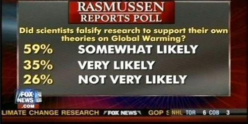
(via)
or to suggest that multiple options are all equally likely, but also supported by large percentages:
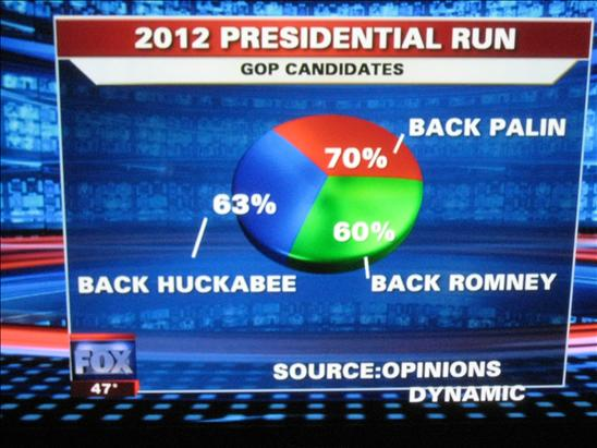
(via)
Changing the units of comparison
When two things are likely to be very similar, one approach to leading information is to present variables in different units. Here is an example where total spending for 2010-2013 is compared to deficits in 2008. This can also be viewed as an example of not labeling the axes.

** (via)
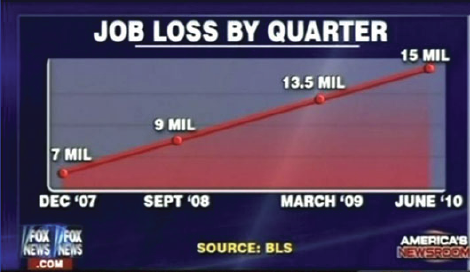
Changing the magnitude of units at different x-values
Here is a plot where the changes in magnitude at high x-values are higher than changes in magnitude at lower x-values. Again, I think this is actually a novel graphical technique for leading readers in one direction.

(via)
To really see the difference, compare to the graph with common changes in magnitude at all x-values.

(via)
Changing trends by sub-sampling x values (also misleading chart titles)
Here is a graph that shows unemployment rates over time and the corresponding chart with the x-axis appropriately laid out.

(via)
One could argue these are mistakes, but based on the consistent displays of data supporting one viewpoint, I think these are likely the result of someone with real statistical training who is using data in a very specific way to make a point. Obviously, Fox News isn’t the only organization that does this sort of thing, but it is interesting to see how much effort they put into statistical graphics.
25 Nov 2012
- My wife used to teach at Grinnell College, so we were psyched to see that a Grinnell player set the NCAA record for most points in a game. We used to go to the games, which were amazing to watch, when we lived in Iowa. The system the coach has in place there is a ton of fun to watch and is based on statistics!
- Someone has to vet the science writers at the Huffpo. This is out of control, basically claiming that open access publishing is harming science. I mean, I’m all about being a curmudgeon and all, but the internet exists now, so we might as well get used to it.
- This one is probably better for Steven’s blog, but this is a pretty powerful graph about the life-saving potential of vaccines.
- Roger posted yesterday about the NY Times piece on deep learning. It is one of our most shared posts of all time, you should also check out the comments, which are exceedingly good. Two things I thought I’d point out in response to a lot of the reaction: (1) I think part of Roger’s post was suggesting that the statistics community should adopt some of CS’s culture of solving problems with already existing, really good methods and (2) I tried searching for a really clear example of “deep learning” yesterday so we could try some statistics on it and didn’t find any really clear explanations. Does anyone have a really simple example of deep learning (ideally with code) so we can see how it relates to statistical concepts?
24 Nov 2012
This article in the New York Times today describes some of the advances that computer scientists have made in recent years.
The technology, called deep learning, has already been put to use in services like Apple’s Siri virtual personal assistant, which is based on Nuance Communications’ speech recognition service, and in Google’s Street View, which uses machine vision to identify specific addresses.
But what is new in recent months is the growing speed and accuracy of deep-learning programs, often called artificial neural networks or just “neural nets” for their resemblance to the neural connections in the brain.
Deep learning? Really?
Okay, names aside, there are a few things to say here. First, the advances described in the article are real–I think that’s clear. There’s a lot of pretty cool stuff out there (including Siri, in my opinion) coming from the likes of Google, Microsoft, Apple, and many others and, frankly, I appreciate all of it. I hope to have my own self-driving car one day.
The question is how did we get here? What worries me about this article and many others is that you can get the impression that there were tremendous advances in the technology/methods used. But I find that hard to believe given that the methods that are often discussed in these advances are methods that have been around for quite a while (neural networks, anyone?). The real advance has been in the incorporation of data into these technologies and the use of statistical models. The interesting thing is not that the data are big, it’s that we’re using data at all.
Did Nate Silver produce a better prediction of the election than the pundits because he had better models or better technology? No, it’s because he bothered to use data at all. This is not to downplay the sophistication of Silver’s or others’ approach, but many others did what he did (presumably using different methods–I don’t think there was collaboration) and more or less got the same results. So the variation across different models is small, but the variation between using data vs. not using data is, well, big. Peter Norvig notes this in his talk about how Google uses data for translation. An area that computational linguists had been working on for decades was advanced dramatically by a ton of data and (a variation of) Bayes’ Theorem. I may be going out on a limb here, but I don’t think it was Bayes’ Theorem that did the trick. But there will probably be an article in the New York Times soon about how Bayes’ Theorem is revolutionizing artificial intelligence. Oh wait, there already was one.
It may sound like I’m trying to bash the computer scientists here, but I’m not. It would be too too easy for me to write a post complaining about how the computer scientists have stolen the ideas that statisticians have been using for decades and are claiming to have discovered new approaches to everything. But that’s exactly what is happening and good for them.
I don’t like to frame everything as an us-versus-them scenario, but the truth is the computer scientists are winning and the statisticians are losing. The reason is that they’ve taken our best ideas and used them to solve problems that matter to people. Meanwhile, we should have been stealing the computer scientists’ best ideas and using them to solve problems that matter to people. But we didn’t. And now we’re playing catch-up, and not doing a particularly good job of it.
That said, I believe there’s still time for statistics to play a big role in “big data”. We just have to choose to do it. Borrowing ideas from other fields is good–that’s why it’s called “re”search, right? Statisticians shouldn’t be shy about it. Otherwise, all we’ll have left to do is complain about how all those people took what we’d been working on for decades and…made it useful.
 Follow us on twitter