 Follow us on twitter
 The statisticians at Fox News use classic and novel graphical techniques to lead with data
26 Nov 2012Depending on where you land in the political spectrum you may either love or despise Fox News. But regardless of your political affiliation, you have to recognize that their statisticians are well-trained in the art of using graphics to persuade folks of a particular viewpoint. I’m not the first to recognize that the graphics department uses some clever tricks to make certain points. But when flipping through the graphs I thought it was interesting to highlight some of the techniques they use to persuade. Some are clearly classics from the literature, but some are (as far as I can tell) newly developed graphical “persuasion” techniques.
Truncating the y-axis

(via)
and

(via)
This is a pretty common technique for leading the question in statistical graphics, as discussed here and elsewhere.
Numbers that don’t add up
I’m not sure whether this one is intentional or not, but it crops up in several places and I think is a unique approach to leading information, at least I couldn’t find a reference in the literature. Basically the idea is to produce percentages that don’t add to one, allowing multiple choices to have closer percentages than they probably should:
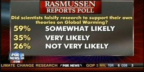
(via)
or to suggest that multiple options are all equally likely, but also supported by large percentages:
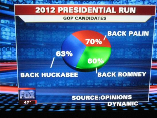
(via)
Changing the units of comparison
When two things are likely to be very similar, one approach to leading information is to present variables in different units. Here is an example where total spending for 2010-2013 is compared to deficits in 2008. This can also be viewed as an example of not labeling the axes.

** (via)
Changing the magnitude of units at different x-values
Here is a plot where the changes in magnitude at high x-values are higher than changes in magnitude at lower x-values. Again, I think this is actually a novel graphical technique for leading readers in one direction.

(via)
To really see the difference, compare to the graph with common changes in magnitude at all x-values.

(via)
Changing trends by sub-sampling x values (also misleading chart titles)
Here is a graph that shows unemployment rates over time and the corresponding chart with the x-axis appropriately laid out.

(via)
One could argue these are mistakes, but based on the consistent displays of data supporting one viewpoint, I think these are likely the result of someone with real statistical training who is using data in a very specific way to make a point. Obviously, Fox News isn’t the only organization that does this sort of thing, but it is interesting to see how much effort they put into statistical graphics.