18 Jan 2013
My colleague John McGready has just published a study he conducted comparing the outcomes of students in the online and in-class versions of his Statistical Reasoning in Public Health class that he teaches here in the fall. In this class the online and in-class portions are taught concurrently, so it’s basically one big class where some people are not in the building. Everything is the same for both groups–quizzes, tests, homework, instructor, lecture notes. From the article:
The on-campus version employs twice-weekly 90 minute live lectures. Online students view pre-recorded narrated versions of the same materials. Narrated lecture slides are made available to on-campus students.
The on-campus section has 5 weekly office hour sessions. Online students communicate with the course instructor asynchronously via email and a course bulletin board. The instructor communicates with online students in real time via weekly one-hour online sessions. Exams and quizzes are multiple choice. In 2005, on-campus students took timed quizzes and exams on paper in monitored classrooms. Online students took quizzes via a web-based interface with the same time limits. Final exams for the online students were taken on paper with a proctor.
So how did the two groups fair in their final grades? Pretty much the same. First off, the two groups of students were not the same. Online students were 8 years older on average, more likely to have an MD degree, and more likely to be male. Final exam scores between online and in-class groups differed by -1.2 (out of 100, online group was lower) and after adjusting for student characteristics they differed by -1.5. In both cases, the difference was not statistically significant.
This was not a controlled trial and so there are possibly some problems with unmeasured confounding given that the populations appeared fairly different. It would be interesting to think about a study design that might allow a measure of control or perhaps get a better measure of the difference between online and on-campus learning. But the logistics and demographics of the students would seem to make this kind of experiment challenging.
Here’s the best I can think of right now: Take a large class (where all students are on-campus) and get a classroom that can fit roughly half the number of students in the class. Then randomize half the students to be in-class and the other half to be online up until the midterm. After the midterm cross everyone over so that the online group comes into the classroom and the in-class group goes online to take the final. It’s not perfect–One issue is that course material tends to get harder as the term goes on and it may be that the “easier” material is better learned online and the harder material is better learned on-campus (or vice versa). Any thoughts?
16 Jan 2013
I just got a copy of Winston Chang’s book R Graphics Cookbook, published by O’Reilly Media. This book follows now a series of O’Reilly books on R, including an R Cookbook. Winston Chang is a graduate student at Northwestern University but is probably better known to R users as an active member of the ggplot2 mailing list and an active contributor to the ggplot2 source code.
The book has a typical cookbook format. After some preliminaries about how to install R packages and how to read data into R (Chapter 1), he quickly launches into exploratory data analysis and graphing. The basic outline of each section is:
- Statement of problem (“You want to make a histogram”)
- Solution: If you can reasonably do it with base R graphics, here’s how you do it. Oh, and here’s how you do it in ggplot2. Notice how it’s better? (He doesn’t actually say that. He doesn’t have to.)
- Discussion: This usually revolves around different options that might be set or alternative approaches.
- See also: Other recipes in the book.
Interestingly, nowhere in the book is the lattice package mentioned (except in passing). But I suppose that’s because ggplot2 pretty much supersedes anything you might want to do in the lattice package. Recently, I’ve been wondering what the future of the lattice package is given that it doesn’t seem to me to be going under very active development. But I digress….
Overall, the book is great. I learned quite a few things just in my initial read of the book and as I dug in a bit more there were some functions that I was not familiar with. Much of the material is straight up ggplot2 stuff so if you’re an expert there you probably won’t get a whole lot more. But my guess is that most are not experts and so will be able to get something out of the book.
The meat of the book covers a lot of different plotting techniques, enough to make your toolbox quite full. If you pick up this book and think something is missing, my guess is that you’re making some pretty esoteric plots. I enjoyed the few sections on specifying colors as well as the recipes on making maps (one of ggplot2’s strong points). I wish there were more map recipes, but hey, that’s just me.
Towards the end there’s a nice discussion of graphics file formats (PDF, PNG, WMF, etc.) and the advantages and disadvantages of each (Chapter 14: Output for Presentation). I particularly enjoyed the discussion of fonts in R graphics since I find this to be a fairly confusing aspect of R, even for seasoned users.
The book ends with a series of recipes related to data manipulation. It’s funny how many recipes there are about modifying factor variables, but I guess this is just a function of how annoying it is to modify factor variables. There’s also some highlighting of the plyr and reshape2 packages.
Ultimately, I think this is a nice complement to Hadley Wickham’s _ggplot2 _as most of the recipes focus on implementing plots in ggplot2. I don’t think you necessarily need to have a deep understanding of ggplot2 in order to use this book (there are some details in an appendix), but some people might want to grab Hadley’s book for more background. In fact, this may be a better book to use to get started with ggplot2 simply because it focuses on specific applications. I kept thinking that if the book had been written using base graphics only, it’d probably have to be 2 or 3 times longer just to fit all the code in, which is a testament to the power and compactness of the ggplot2 approach.
One last note: I got the e-book version of the book, but I would recommend the paper version. With books like these, I like to flip around constantly (since there’s no need to read it in a linear fashion) and I find e-readers like iBooks and Kindle Reader to be not so good at this.
16 Jan 2013
I just got this from a former student who is working on a project with me:

Awesome.
14 Jan 2013

Recent reports of air pollution levels out of Beijing are very very disturbing. Levels of fine particulate matter (PM2.5, or PM less than 2.5 microns in diameter) have reached unprecedented levels. So high are the levels that even the official media are allowed to mention it.
Here is a photograph of downtown Beijing during the day (Thanks to Sarah E. Burton for the photograph). Hourly levels of PM2.5 hit over 900 micrograms per cubic meter in some parts of the city and 24-hour average levels (the basis for most air quality standards) reached over 500 micrograms per cubic meter. Just for reference, the US national ambient air quality standard for the 24-hour average level of PM2.5 is 35 micrograms per cubic meter.
Below is a plot of the PM2.5 data taken from the US Embassy’s rooftop monitor.

The solid circles indicate the 24-hour average for the day. The red line is the median of the daily averages for the time period in the plot (about 6 weeks) and the dotted blue line is the US 24-hour national ambient air quality standard. The median for the period was about 91 micrograms per cubic meter.
First, it should be noted that a “typical” day of 91 micrograms per cubic meter is still crazy. But suppose we take 91 to be a typical day. Then in a city like Beijing, which has about 20 million people, if we assume that about 700 people die on a typical day, then the last 5 days alone would experience about 307 excess deaths from all causes. I get this from using a rough estimate of a 0.3% increase in all-cause mortality per 10 microgram per cubic meter increase in PM2.5 levels (studies from China and the US tend to report risks in roughly this area). The 700 deaths per day number is a fairly back-of-the-envelope number that I got simply using comparisons to other major cities. Numbers for things like excess hospitalizations will be higher because both the risks and the baselines are higher. For example, in the US, we estimate about a 1.28% increase in heart failure hospitalization for a 10 microgram per cubic meter increase in PM2.5.
If you like, you can also translate current levels to numbers of cigarettes smoked. If you assume a typical adult inhales about 18-20 cubic meters of air per day, then in the last 5 days, the average Beijinger smoked about 3 cigarettes just by getting out of bed in the morning.
Lastly, I want to point to a nice series of photos that the Guardian has collected on the (in)famous London Fog of 1952. Although the levels were quite a bit worse back then (about 2-3 times worse, if you can believe it), the photos bear a striking resemblance to today’s Beijing.
At least in the US, the infamous smog episodes that occurred regularly only 60 years ago are pretty much non-existent. But in many places around the world, “crazy bad” air pollution is part of everyday life.
13 Jan 2013
- These are some great talks. But definitely watch Michael Eisen’s talk on E-biomed and the history of open access publication. This is particularly poigniant in light of Aaron Swartz’s tragic suicide. It’s also worth checking out the twitter hashtag #pdftribute .
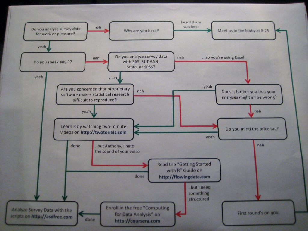
- An awesome flowchart before a talk given by the creator of the R twotuorials. Roger gets a shoutout (via civilstat).
- This blog selects a position at random on the planet earth every day and posts the picture taken closest to that point. Not much about the methodology on the blog, but totally fascinating and a clever idea.
- A set of data giving a “report card” for each state on how that state does in improving public education for students. I’m not sure I believe the grades, but the underlying reports look interesting.
 Follow us on twitter