16 Jun 2014
Academic publishing has always been a slow process. Typically you would submit a paper for publication and then wait a few months to more than a year (statistics journals can be slow!) for a review. Then you’d revise the paper in a process that would take another couple of months, resubmit it and potentially wait another few months while this second set of reviews came back.
Lately statistics and statistical genomics have been doing more of what math does and posting papers to the arxiv or to biorxiv. I don’t know if it is just me, but using this process has led to a massive speedup in the rate that my academic work gets used/disseminated. Here are a few examples of how crazy it is out there right now.
I started a post on giving talks on Github. It was tweeted before I even finished!
I really appreciate the compliment, especially coming from someone whose posts I read all the time, but it was wild to me that I hadn’t even finished the post yet (still haven’t) and it was already public.
Another example is that we have posted several papers on biorxiv and they all get tweeted/read. When we posted the Ballgown paper it was rapidly discussed. The day after it was posted, there were already blog posts about the paper up.
We also have been working on another piece of software on Github that hasn’t been published yet, but have already had multiple helpful contributions from people outside our group.
While all of this is going on, we have a paper out to review that we have been waiting to hear about for multiple months. So while open science is dramatically speeding up the rate at which we disseminate our results, the speed isn’t evenly distributed.
13 Jun 2014
Hilary Mason asked a really interesting question yesterday:
You should really consider reading the whole discussion here it is amazing. But it also inspired me to write a post about what I do, as told by other people on Twitter. I apologize in advance if I missed your tweet, there was way too much good stuff to get them all.
Step 0: Figure out what I’m trying to do with the data
At least for me I come to a new data set in one of three ways: (1) I made it myself, (2) a collaborator created a data set with a specific question in mind, or (3) a collaborator created a data set and just wants to explore it. In the first case and the second case I already know what the question is, although sometimes in case (2) I still spend a little more time making sure I understand the question before diving in. @visualisingdata and I think alike here:
Usually this involves figuring out what the variables mean like @_jden does:
If I’m working with a collaborator I do what @evanthomaspaul does:
If the data don’t have a question yet, I usually start thinking right away about what questions can actually be answered with the data and what can’t. This prevents me from wasting a lot of time later chasing trends. @japerk does something similar:
Step 1: Learn about the elephant Unless the data is something I’ve analyzed a lot before, I usually feel like the blind men and the elephant.

So the first thing I do is fool around a bit to try to figure out what the data set “looks” like by doing things like what @jasonpbecker does looking at the types of variables I have, what the first few observations and last few observations look like.
If it is medical/social data I usually use this to look for personally identifiable information and then do what @peteskomoroch does:
If the data set is really big, I usually take a carefully chosen random subsample to make it possible to do my exploration interactively like @richardclegg
After doing that I look for weird quirks, like if there are missing values or outliers like @feralparakeet
and like @cpwalker07
and like @toastandcereal
and like @cld276
and @adamlaiacano
Step 2: Clean/organize I usually use the first exploration to figure out things that need to be fixed so that I can mess around with a tidy data set. This includes fixing up missing value encoding like @chenghlee
or more generically like: @RubyChilds
I usually do a fair amount of this, like @the_turtle too:
When I’m done I do a bunch of sanity checks and data integrity checks like @deaneckles and if things are screwed up I got back and fix them:
Step 3: Plot. That. Stuff. After getting a handle with mostly text based tables and output (things that don’t require a graphics device) and cleaning things up a bit I start with plotting everything like @hspter
At this stage my goal is to get the maximum amount of information about the data set in the minimal amount of time. So I do not make the graphs pretty (I think there is a distinction between exploratory and expository graphics). I do histograms and jittered one d plots to look at variables one by one like @FisherDanyel
To compare the distributions of variables I usually use overlayed density plots like @sjwhitworth
I make tons of scatterplots to look at relationships between variables like @wduyck
I usually color/size the dots in the scatterplots by other variables to see if I can identify any confounding relationships that might screw up analyses downstream. Then, if the data are multivariate, I do some dimension reduction to get a feel for high dimensional structure. Nobody mentioned principal components or hierarchical clustering in the Twitter conversation, but I end up using these a lot to just figure out if there are any weird multivariate dependencies I might have missed.
Step 4: Get a quick and dirty answer to the question from Step 1
After I have a feel for the data I usually try to come up with a quick and dirty answer to the question I care about. This might be a simple predictive model (I usually use 60% training, 40% test) or a really basic regression model when possible, just to see if the signal is huge, medium or subtle. I use this as a place to start when doing the rest of the analysis. I also often check this against the intuition of the person who generated the data to make sure something hasn’t gone wrong in the data set.
06 Jun 2014
Reproducible research has been on my mind a bit these days, partly because it has been in the news with the Piketty stuff, and also perhaps because I just published a book on it and I’m teaching a class on it as we speak (as well as next month and the month after…).
However, as I watch and read many discussions over the role of reproducibility in science, I often feel that many people miss the point. Now, just to be clear, when I use the word “reproducibility” or say that a study is reproducible, I do not mean “independent verification” as in a separate investigator conducted an independent study and came to the same conclusion as the original study (that is what I refer to as “replication”). By using the word reproducible, I mean that the original data (and original computer code) can be analyzed (by an independent investigator) to obtain the same results of the original study. In essence, it is the notion that the data analysis can be successfully repeated_. _Reproducibility is particularly important in large computational studies where the data analysis can often play an outsized role in supporting the ultimate conclusions.
Many people seem to conflate the ideas of reproducible and correctness, but they are not the same thing. One must always remember that a study can be reproducible and still be wrong. By “wrong”, I mean that the conclusion or claim can be wrong. If I claim that X causes Y (think “sugar causes cancer”), my data analysis might be reproducible, but my claim might ultimately be incorrect for a variety of reasons. If my claim has any value, then others will attempt to replicate it and the correctness of the claim will be determined by whether others come to similar conclusions.
Then why is reproducibility so important? Reproducibility is important because it is the only thing that an investigator can guarantee about a study.
Contrary to what most press releases would have you believe, an investigator cannot guarantee that the claims made in a study are correct (unless they are purely descriptive). This is because in the history of science, no meaningful claim has ever been proven by a single study. (The one exception might be mathematics, whether they are literally proving things in their papers.) So reproducibility is important not because it ensures that the results are correct, but rather because it ensures transparency and gives us confidence in understanding exactly what was done.
These days, with the complexity of data analysis and the subtlety of many claims (particularly about complex diseases), reproducibility is pretty much the only thing we can hope for. Time will tell whether we are ultimately right or wrong about any claims, but reproducibility is something we can know right now.
03 Jun 2014
The latest crisis in data analysis comes to us (once again) from the field of Economics. Thomas Piketty, a French economist recently published a book titled Capital in the 21st Century that has been a best-seller. I have not read the book, but based on media reports, it appears to make the claim that inequality has increased in recent years and will likely increase into the future. The book argues that this increase in inequality is driven by capitalism’s tendency to reward capital more than labor. This is my non-economist’s understanding of the book, but the details specific claims of the book are not what I want to discuss here (there is much discussion elsewhere).
An interesting aspect of Piketty’s work, from my perspective, is that he has made all of his data and analysis available on the web. From what I can tell, his analysis was not trivial—data were collected and merged from multiple disparate sources and adjustments were made to different data series to account for various incompatibilities. To me, this sounds like a standard data analysis, in the sense that all meaningful data analyses are complicated. As noted by Nate Silver, data do not arise from a “virgin birth”, and in any example worth discussing, much work has to be done to get the data into a state in which statistical models can be fit, or even more simply, plots can be made.
Chris Giles, a journalist for the Financial Times, recently published a column (unfortunately blocked by paywall) in which he claimed that much of the analysis that Piketty had done was flawed or incorrect. In particular, he claimed that based on his (Giles’) analysis, inequality was not growing as much over time as Piketty claimed. Among other points, Giles claims that numerous errors were made in assembling the data and in Piketty’s original analysis.
This episode smacked of the recent Reinhart-Rogoff kerfuffle in which some fairly basic errors were discovered in those economists’ Excel spreadsheets. Some of those errors only made small differences to the results, but a critical methodological component, in which the data were weighted in a special way, appeared to have a significant impact on the results if alternate approaches were taken.
Piketty has since responded forcefully to the FT’s column, defending all of the work he has done and addressing the criticisms one by one. To me, the most important result of the FT analysis is that Piketty’s work appears to be largely reproducible. Piketty made his data available, with reasonable documentation (in addition to his book), and Giles was able to come up with the same numbers Piketty came up with. This is a good thing. Piketty’s work was complex, and the only way to communicate the entirety of it was to make the data and code available.
The other aspects of Giles’ analysis are, from an academic standpoint, largely irrelevant to me, particularly because I am not an economist. The reason I find them irrelevant is because the objections are largely over whether he is correct or not. This is an obviously important question, but in any field, no single study or even synthesis can be determined to be “correct” at that instance. Time will tell, and if his work is “correct”, his predictions will be borne out by nature. It’s not so satisfying to have to wait many years to know if you are correct, but that’s how science works.
In the meantime, economists will have a debate over the science and the appropriate methods and data used for analysis. This is also how science works, and it is only (really) possible because Piketty made his work reproducible. Otherwise, the debate would be largely uninformed.
28 May 2014
In the past couple of years several non-statisticians have asked me “what is Big Data exactly?” or “How big is Big Data?”. My answer has been “I think Big Data is much more about “data” than “big”. I explain below.

|

|
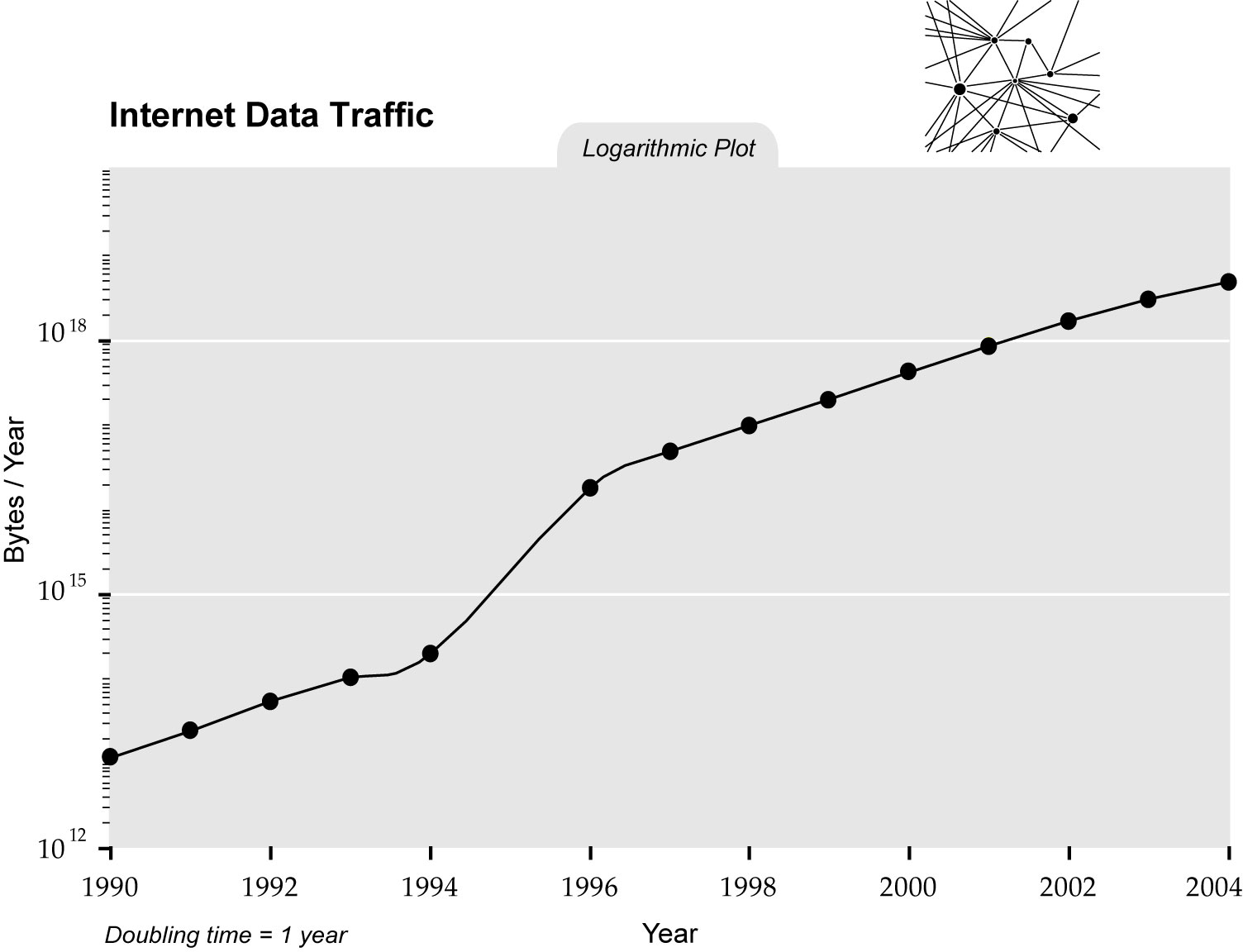
Since 2011 Big Data has been all over the news. The New York Times, The Economist, Science, Nature, etc.. have told us that the Big Data Revolution is upon us (see google trends figure above). But was this really a revolution? What happened to the Massive Data Revolution (see figure above)? For this to be called a revolution, there must be some a drastic change, a discontinuity, or a quantum leap of some kind. So has there been such a discontinuity in the rate of growth of data? Although this may be true for some fields (for example in genomics, next generation sequencing did introduce a discontinuity around 2007), overall, data size seems to have been growing at a steady rate for decades. For example, in the graph below (see this paper for source) note the trend in internet traffic data (which btw dwarfs genomics data). There does seem to be a change of rate but during the 1990s which brings me to my main point.

Although several fields (including Statistics) are having to innovate to keep up with growing data size, I don’t see this as something that new. But I do think that we are in the midst of a Big Data revolution. Although the media only noticed it recently, it started about 30 years ago. The discontinuity is not in the size of data, but in the percent of fields (across academia, industry and government) that use data. At some point in the 1980s with the advent of cheap computers, data were moved from the file cabinet to the disk drive. Then in the 1990s, with the democratization of the internet, these data started to become easy to share. All of the sudden, people could use data to answer questions that were previously answered only by experts, theory or intuition.
In this blog we like to point out examples but let me review a few. Credit card companies started using purchase data to detect fraud. Baseball teams started scraping data and evaluating players without ever seeing them. Financial companies started analyzing stock market data to develop investment strategies. Environmental scientists started to gather and analyze data from air pollution monitors. Molecular biologists started quantifying outcomes of interest into matrices of numbers (as opposed to looking at stains on nylon membranes) to discover new tumor types and develop diagnostics tools. Cities started using crime data to guide policing strategies. Netflix started using costumer ratings to recommend movies. Retail stores started mining bonus card data to deliver targeted advertisements. Note that all the data sets mentioned were tiny in comparison to, for example, sky survey data collected by astronomers. But, I still call this phenomenon Big Data because the percent of people using data was in fact Big.

I borrowed the title of this talk from a very nice presentation by Diego Kuonen
 Follow us on twitter
 — Richard G. Clegg (@richardclegg)


