11 May 2016
Buzzfeed recently published a long article on the struggles of the secretive data science company, Palantir.
Over the last 13 months, at least three top-tier corporate clients have walked away, including Coca-Cola, American Express, and Nasdaq, according to internal documents. Palantir mines data to help companies make more money, but clients have balked at its high prices that can exceed $1 million per month, expressed doubts that its software can produce valuable insights over time, and even experienced difficult working relationships with Palantir’s young engineers. Palantir insiders have bemoaned the “low-vision” clients who decide to take their business elsewhere.
Palantir’s origins are with PayPal, and its founders are part of the PayPal Mafia. As Peter Thiel describes it in his book Zero to One, PayPal was having a lot of trouble with fraud and the FBI was getting on its case. So PayPal developed some software to monitor the millions of transacations going through its systems and to flag transactions that were suspicious. Eventually, they realized that this kind of software might be useful to government agencies in a variety of contexts and the idea for Palantir was born.
Much of the press reaction to Buzzfeed’s article amounts to schadenfreude over the potential fall of another so-called Silicon Valley unicorn. Indeed, Palentir is valued at $20 billion, a valuation only exceeded in the private markets by Airbnb and Uber. But to me, nothing in the article indicates that Palantir is necessarily more poorly run than your average startup. It looks like they are going through pretty standard growing pains, trying to scale the business and diversify the customer base. It’s not surprising to me that employees would leave at this point—going from startup to “real company” is often not that fun and just a lot of work.
However, a key question that arises is that if Palantir is having trouble trying to scale the business, why might that be? The Buzzfeed article doesn’t contain any answers but in this post I will attempt to speculate.
The real message from the Buzzfeed article goes beyond just Palantir and is highly relevant to the data science world. It ultimately comes down to the question of what is the value of data analysis?, and secondarily, how do you communicate that value?
The Data Science Spectrum
Data science activities live on a spectrum with software on one end and highly customized consulting on another end (I lump a lot of things into consulting, including methods development, modeling, etc.).
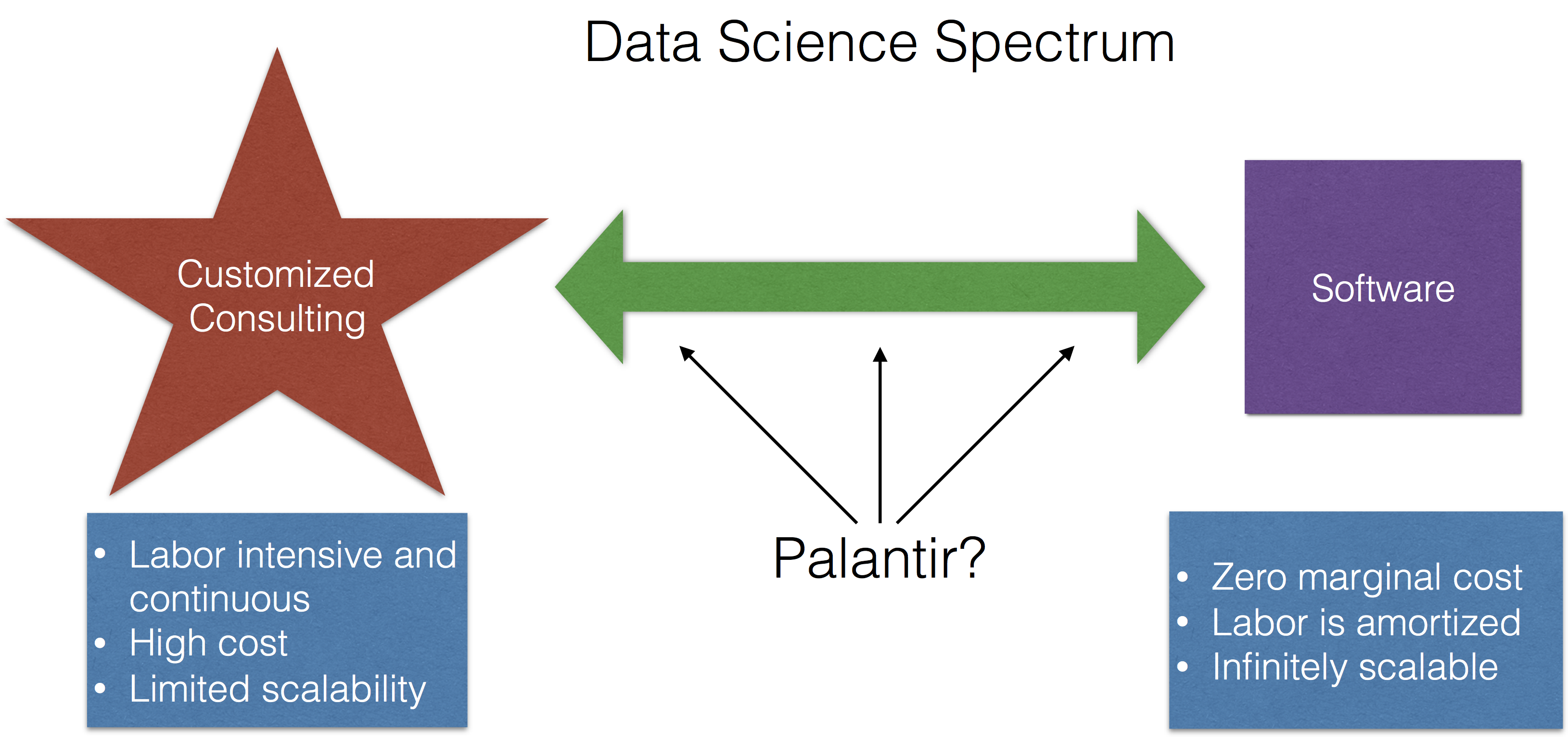
The idea being that if someone comes to you with a data problem, there are two extremes that you might offer to them:
- Give them some software, some documentation, and maybe a brief tutorial on how to use the software, and then send them on their way. For example, if someone wants to see if two groups are different from each other, you could send them the
t.test() function in R and explain how to use it. This could be done over email; you wouldn’t even have to talk to the person.
- Meet with the person, talk about their problem and the question they’re trying to answer, develop an analysis plan, and build a custom software solution that produces the exact output that they’re looking for.
The first option is cheap, simple, and if you had a good enough web site, the person probably wouldn’t even have to talk with you at all! For example, I use this web site for sample size calculations and I’ve never spoken with the author of the web site. Much of the labor is up front, for the development of the software, and then is amortized over the life of the product. Ultimately, a software product has zero marginal cost and so it can be easily replicated and is infinitely scalable.
The second option is labor intensive, time-consuming, ongoing in nature, and is only scalable to the extent that you are willing to forgo sleep and maybe bend the space-time continuum. By definition, a custom solution is unique and is difficult to replicate.
Selling Data Science
An important question for Palantir and data scientists in general is “How do you communicate the value of data analysis?” Many people expect the result of a good data analysis to be something “surprising”, i.e. something that they didn’t already know. Because if they knew it already why bother looking at the data? Think Moneyball—if you can find that “diamond in the rough” it make spending the time to analyze the data worthwhile. But the success of a data analysis can’t depend on the results. What if you go through the data and find nothing? Is the data analysis a failure? We as data scientists can only show what the data show. Otherwise, it just becomes a recipe for telling people what they want to hear.
It’s tempting for a client to say “well, the data didn’t show anything surprising so there’s no value there.” Also, a data analysis may reveal something that is perhaps interesting but doesn’t necessarily lead to any sort of decision. For example, there may be an aspect of a business process that is inefficient but is nevertheless unmodifiable. There may be little perceived value in discovering this with data.
What is Useful?
Palantir apparently tried to develop a relationship with American Express, but ultimately failed.
But some major firms have not found Palantir’s products and services that useful. In April 2015, employees were informed that American Express (codename: Charlie’s Angels) had dumped Palantir after 18 months of cybersecurity work, including a six-month pilot, an email shows. “We struggled from day 1 to make Palantir a sticky product for users and generate wins,” Sid Rajgarhia, a Palantir business development employee, said in the email.
What does it mean for a data analysis product to be useful? It’s not necessarily clear to me in this case. Did Palantir not reveal new information? Did they not highlight something that could be modified?
Lack of Deep Expertise
A failed attempt attempt at working with Coke reveals some other challenges of the data science business model.
The beverage giant also had other concerns [in addition to the price]. Coke “wanted deeper industry expertise in a partner,” Jonty Kelt, a Palantir executive, told colleagues in the email. He added that Coca-Cola’s “working relationship” with the youthful Palantir employees was “difficult.” The Coke executive acknowledged that the beverage giant “needs to get better at working with millennials,” according to Kelt. Coke spokesperson Scott Williamson declined to comment.
Annoying millenials notwithstanding, it’s clear that Coke didn’t feel comfortable collaborating with Palantir’s personnel. Like any data science collaboration, it’s key that the data scientist have some familiarity with the domain. In many cases, having “deep expertise” in an area can give a collaborator confidence that you will focus on the things that matter to them. But developing that expertise costs money and time and it may prevent you from working with other types of clients where you will necessarily have less expertise. For example, Palantir’s long experience working with the US military and intelligence agencies gave them deep expertise in those areas, but how does that help them with a consumer products company?
Harder Than It Looks
The final example of a client that backed out is Kimberly-Clark:
But Kimberly-Clark was getting cold feet by early 2016. In January, a year after the initial pilot, Kimberly-Clark executive Anthony J. Palmer said he still wasn’t ready to sign a binding contract, meeting notes show. Palmer also “confirmed our suspicion” that a primary reason Kimberly-Clark had not moved forward was that “they wanted to see if they could do it cheaper themselves,” Kelt told colleagues in January. [emphasis added]
This is a common problem confronted by anyone in the data science business. A good analysis often looks easy in retrospect—all you did was run some functions and put the data through some models! In fact, running the models probably is the easy part, but getting to the point where you can actually fit models can be incredibly hard. Many clients, not seeing the long and winding process leading to a model, will be tempted think they can do it themselves.
Palantir’s Valuation
Ultimately, what makes Palantir interesting is its astounding valuation. But what is the driver of this valuation? I think the key to answering this question lies in the description of the company itself:
The company, based in Palo Alto, California, is essentially a hybrid software and consulting firm, placing what it calls “forward deployed engineers” on-site at client offices.
What does it mean to be a “hybrid software and consulting firm”? And which one is the company more like? Consulting or software? Because ultimately, revealing which side of the spectrum Palantir is really on could have huge implications for its valuation and future prospects.
Consulting companies can surely make a lot of money, but none to my knowledge have the kind of valuation that Palantir currently commands. If it turns out that every customer of Palantir’s requires a custom solution, then I think they’re likely overvalued, because that model scales poorly. On the other hand, if Palantir has genuinely figured out a way to “software-ize” data analysis and to turn it into a commodity, then they are very likely undervalued.
Given the tremendous difficulty of turning data analysis into a software problem, my guess is that they are more akin to a consulting company and are overvalued. This is not to say that they won’t make money—they will likely make plenty—but that they won’t be the Silicon Valley darling that everyone wants them to be.
10 May 2016
Editor’s note - This is a chapter from my book How to be a modern scientist where I talk about some of the tools and techniques that scientists have available to them now that they didn’t before. 50% of all royalties from the book go to support Data Carpentry to promote data science education.
Social media can serve a variety of roles for modern scientists. Here I am going to focus on the role of social
media for working scientists whose primary focus is not on scientific communication. Something that is often missed by people who are just getting started with social media is that there are two separate components to developing a successful social media presence.
The first is to develop a following and connections
to people in your community. This is achieved through being either a content curator, a content generator, or
being funny/interesting in some other way. This often has nothing to do with your scientific output.
The second component is using your social media presence to magnify the audience for your scientific work. You can
only do this if you have successfully developed a network and community in the first step. Then, when you post about
your own scientific papers they will be shared.
To most effectively achieve all of these goals you need to identify relevant communities and develop a network
of individuals who follow you and will help to share your ideas and work.
Set up social media accounts and follow relevant people/journals
One of the largest academic communities has developed around Twitter, but some scientists are also using Facebook for professional purposes. If you set up a Twitter account, you should then find as many colleagues in your area of expertise that you can find and also any journals that are in your area.
Use your social media account to promote the work of other people
If you just use your social media account to post links to any papers that you publish, it will be hard to develop much of a following. It is also hard to develop a following by constantly posting long form original content such as blog posts. Alternatively you can gain a large number of followers by being (a) funny, (b) interesting, or (c) being a content curator. This latter approach can be particularly useful for people new to social media. Just follow people and journals you find interesting and share anything that you think is important/creative/exciting.
Share any work that you develop
Any code, publications, data, or blog posts you create you can share from your social media account. This can help raise your profile as people notice your good work. But if you only post your own work it is rarely possible to develop a large following unless you are already famous for another reason.
There are a large number of social media platforms that are available to scientists. Creatively using any new social media platform if it has a large number of users can be a way to quickly jump into the consciousness of more people. That being said the two largest communities of scientists have organized around two of the largest social media platforms.
- Twitter - is a platform where you can post short (less than 140 character) messages. This is a great platform for both discovering science and engaging in conversations about topics at a superficial level. It is not particularly useful for in depth scientific discussions.
- Facebook - some scientists post longer form scientific discussions on Facebook, but the community there is somewhat less organized and people tend to use it less for professional reasons. However, sharing content on Facebook, particularly when it is of interest to a general audience, can lead to a broader engagement in your work.
There are also a large and growing number of academic-specific social networks. For the most part these social networks are not widely used by practicing scientists and so don’t represent the best use of your time.
You might also consider short videos on Vine, longer videos on Youtube, more image intensive social media on Tumblr or Instagram if you have content that regularly fits those outlets. But they tend to have smaller communities of scientists with less opportunity for back and forth.
You do not need to develop original content
Social media can be a time suck, particularly if you are spending a lot of time engaging in conversations on your platform of choice. Generating long form content in particular can take up a lot of time. But you don’t need to do that to generate a decent following. Finding the right community and then sharing work within that community and adding brief commentary and ideas can often help you develop a large following which can then be useful for other reasons.
Once you are comfortable using the social media platform of your choice you can start to engage with other people in conversation or add comments when you share other people’s work. This will increase the interest in your social media account and help you develop followers. This can be as simple as one-liners copied straight from the text of papers or posts that you think are most important.
Make online friends - then meet them offline
One of the biggest advantages of scientific social media is that it levels the playing ground. Don’t be afraid to engage with members of your scientific community at all levels, from members of the National Academy (if they are online!) all the way down to junior graduate students. Getting to know a diversity of people can really help you during scientific meetings and visits. If you spend time cultivating online friendships, you’ll often meet a “familiar handle” at any conference or meeting you go to.
Include images when you can
If you see a plot from a paper you think is particularly compelling, copy it and attach it when you post/tweet when you link to the paper. On social media, images are often better received than plain text.
One thing to keep in mind on social media is the amplification of opinions. There are a large number of issues that are of extreme interest and generate really strong opinions on multiple sides. Some of these issues are common societal issues (e.g., racism, feminism, economic inequality) and some are specific to science (e.g., open access publishing, open source development). If you are starting a social media account to engage in these topics then you should definitely do that. If you are using your account primarily for scientific purposes you should consider carefully the consequences of wading into these discussions. The debates run very hot on social media and you may post what you consider to be a relatively tangential or light message on one of these topics and find yourself the center of a lot of attention (positive and negative).
05 May 2016
For a few years now I have given a guest lecture on time series analysis in our School’s Environmental Epidemiology course. The basic thrust of this lecture is that you should generally ignore what you read about time series modeling, either in papers or in books. The reason is because I find much of the time series literature is not particularly helpful when doing analyses in a biomedical or population health context, which is what I do almost all the time.
Prediction vs. Inference
First, most of the literature on time series models tends to assume that you are interested in doing prediction—forecasting future values in a time series. I almost am never doing this. In my work looking at air pollution and mortality, the goal is never to find the best model that predicts mortality. In particular, if our goal were to predict mortality, we would probably never include air pollution as a predictor. This is because air pollution has an inherently weak association with mortality at the population, whereas things like temperature and other seasonal factors tend to have a much stronger association.
What I am interested in doing is estimating an association between changes in air pollution levels and mortality and making some sort of inference about that association, either to a broader population or to other time periods. The challenges in these types of analyses include estimating weak associations in the presence of many stronger signals and appropriately adjusting for any potential confounding variables that similarly vary over time.
The reason the distinction between prediction and inference is important is that focusing on one vs. the other can lead you to very different model building strategies. Prediction modeling strategies will always want you to include into the model factors that are strongly correlated with the outcome and explain a lot of the outcome’s variation. If you’re trying to do inference and use a prediction modeling strategy, you may make at least two errors:
- You may conclude that your key predictor of interest (e.g. air pollution) is not important because the modeling strategy didn’t deem to include it
- You may omit important potential confounders because they have a weak releationship with the outcome (but maybe have a strong relationship with your key predictor). For example, one class of potential confounders in air pollution studies is other pollutants, which tend to be weakly associated with mortality but may be strongly associated with your pollutant of interest.
Random vs. Fixed
Another area where I feel much time series literature differs from my practice is on the whether to focus on fixed effects or random effects. Most of what you might think of when you think of time series models (i.e. AR models, MA models, GARCH, etc.) focuses on modeling the random part of the model. Often, you end up treating time series data as random because you simply do not have any other data. But the reality is that in many biomedical and public health applications, patterns in time series data can be explained by clearly understood fixed patterns.
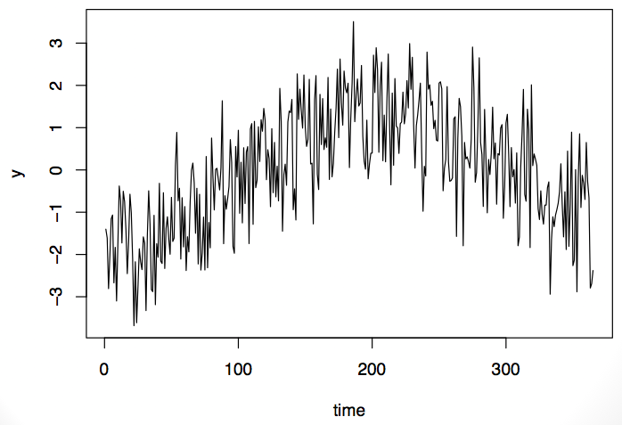
For example, take this time series here. It is lower at the beginning and at the end of the series, with higher level sin the middle of the period.

It’s possible that this time series could be modeled with an auto-regressive (AR) model or maybe an auto-regressive moving average (ARMA) model. Or it’s possible that the data are exhibiting a seasonal pattern. It’s impossible to tell from the data whether this is a random formulation of this pattern or whether it’s something you’d expect every time. The problem is that we usually onl have one observation from teh time series. That is, we observe the entire series only once.
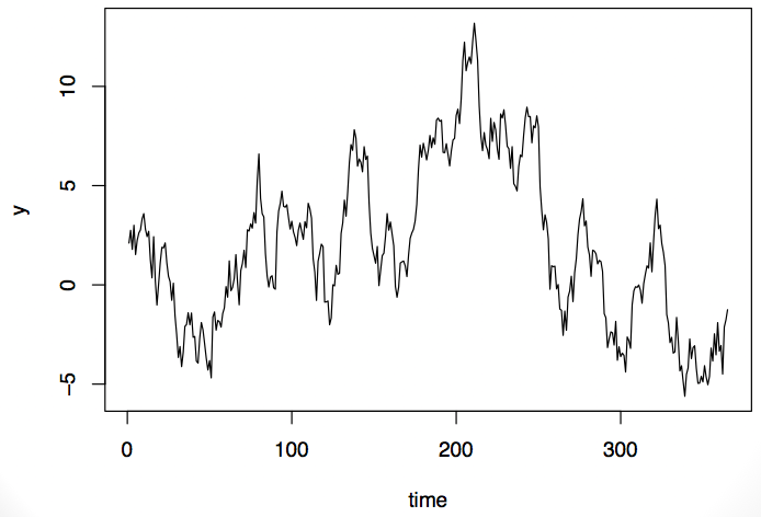
Now take a look at this time series. It exhibits some of the same properties as the first series: it’s low at the beginning and end and high in the middle.

Should we model this as a random process or as a process with a fixed pattern? That ultimately will depend on the what type of data this is and what we know about it. If it’s air pollution data, we might do one thing, but if it’s stock market data, we might do a totally different thing.
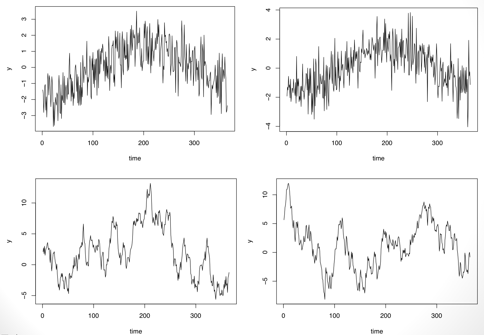
If one were to see replicates of the time series, we’d be able to resolve the fixed vs. random question. For example, because I simulated the data above, I can simulate another replicate and see what happens. In the plot below I show two replications from each of the processes.

It’s clear now that the time series on the top row has a fixed “seasonal” pattern while the time series on the bottom row is random (in fact it is simulated from an AR(1) model).
The point here is that I think very often we know things about the time series that we’re modeling that we know introduced fixed variation into the data: seasonal patterns, day-of-week effects, and long-term trends. Furthermore, there may be other time-varying covariates that can help predict whatever time series we’re modeling and can be put into the fixed part of the model (a.k.a regression modeling). Ultimately, when many of these fixed components are accounted for, there’s relatively little of interest left in the residuals.
What to Model?
So the question remains: What should I do? The short answer is to try to incorporate everything that you know about the data into the fixed/regression part of the model. Then take a look at the residuals and see if you still care.
Here’s a quick example from my work in air pollution and mortality. The data are all-cause mortality and PM10 pollution from Detroit for the years 1987–2000. The question is whether daily mortaliy is associated with daily changes in ambient PM10 levels. We can try to answer that with a simple linear regression model:
Call:
lm(formula = death ~ pm10, data = ds)

Residuals:
    Min      1Q  Median      3Q     Max
-26.978  -5.559  -0.386   5.109  34.022

Coefficients:
             Estimate Std. Error t value Pr(>|t|)
(Intercept) 46.978826   0.112284 418.394   <2e-16
pm10         0.004885   0.001936   2.523   0.0117

Residual standard error: 8.03 on 5112 degrees of freedom
Multiple R-squared:  0.001244,	Adjusted R-squared:  0.001049
F-statistic: 6.368 on 1 and 5112 DF,  p-value: 0.01165
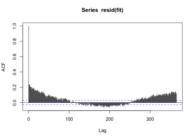
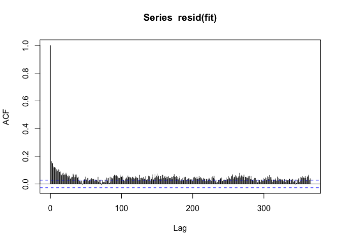
PM10 appears to be positively associated with mortality, but when we look at the autocorrelation function of the residuals, we see

If we see a seasonal-like pattern in the auto-correlation function, then that means there’s a seasonal pattern in the residuals as well. Not good.
But okay, we can just model the seasonal component with an indicator of the season.
Call:
lm(formula = death ~ season + pm10, data = ds)

Residuals:
    Min      1Q  Median      3Q     Max
-25.964  -5.087  -0.242   4.907  33.884

Coefficients:
             Estimate Std. Error t value    Pr(>|t|)
(Intercept) 50.830458   0.215679 235.676     < 2e-16
seasonQ2    -4.864167   0.304838 -15.957     < 2e-16
seasonQ3    -6.764404   0.304346 -22.226     < 2e-16
seasonQ4    -3.712292   0.302859 -12.258     < 2e-16
pm10         0.009478   0.001860   5.097 0.000000358

Residual standard error: 7.649 on 5109 degrees of freedom
Multiple R-squared:  0.09411,	Adjusted R-squared:  0.09341
F-statistic: 132.7 on 4 and 5109 DF,  p-value: < 2.2e-16
Note that the coefficient for PM10, the coefficient of real interest, gets a little bigger when we add the seasonal component.
When we look at the residuals now, we see

The seasonal pattern is gone, but we see that there’s positive autocorrelation at seemingly long distances (~100s of days). This is usually an indicator that there’s some sort of long-term trend in the data. Since we only care about the day-to-day changes in PM10 and mortality, it would make sense to remove any such long-term trend. I can do that by just including the date as a linear predictor.
Call:
lm(formula = death ~ season + date + pm10, data = ds)

Residuals:
    Min      1Q  Median      3Q     Max
-23.407  -5.073  -0.375   4.718  32.179

Coefficients:
               Estimate  Std. Error t value    Pr(>|t|)
(Intercept) 60.04317325  0.64858433  92.576     < 2e-16
seasonQ2    -4.76600268  0.29841993 -15.971     < 2e-16
seasonQ3    -6.56826695  0.29815323 -22.030     < 2e-16
seasonQ4    -3.42007191  0.29704909 -11.513     < 2e-16
date        -0.00106785  0.00007108 -15.022     < 2e-16
pm10         0.00933871  0.00182009   5.131 0.000000299

Residual standard error: 7.487 on 5108 degrees of freedom
Multiple R-squared:  0.1324,	Adjusted R-squared:  0.1316
F-statistic:   156 on 5 and 5108 DF,  p-value: < 2.2e-16
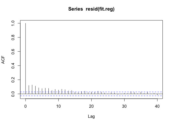
Now we can look at the autocorrelation function one last time.

The ACF trails to zero reasonably quickly now, but there’s still some autocorrelation at short lags up to about 15 days or so.
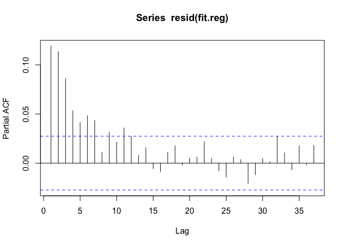
Now we can engage in some traditional time series modeling. We might want to model the residuals with an auto-regressive model over order p. What should p be? We can check by looking at the partial autocorrelation function (PACF).

The PACF seems to suggest we should fit an AR(6) or AR(7) model. Let’s use an AR(6) model and see how things look. We can use the arima() function for that.
Call:
arima(x = y, order = c(6, 0, 0), xreg = m, include.mean = FALSE)

Coefficients:
         ar1     ar2     ar3     ar4     ar5     ar6  (Intercept)
      0.0869  0.0933  0.0733  0.0454  0.0377  0.0489      59.8179
s.e.  0.0140  0.0140  0.0141  0.0141  0.0140  0.0140       1.0300
      seasonQ2  seasonQ3  seasonQ4     date    pm10
       -4.4635   -6.2778   -3.2878  -0.0011  0.0096
s.e.    0.4569    0.4624    0.4546   0.0001  0.0018

sigma^2 estimated as 53.69:  log likelihood = -17441.84,  aic = 34909.69
Note that the coefficient for PM10 hasn’t changed much from our initial models. The usual concern with not accounting for residual autocorrelation is that the variance/standard error of the coefficient of interest will be affected. In this case, there does not appear to be much of a difference between using the AR(6) to account for the residual autocorrelation and ignoring it altogether. Here’s a comparison of the standard errors for each coefficient.
               Naive AR model
(Intercept) 0.648584 1.030007
seasonQ2    0.298420 0.456883
seasonQ3    0.298153 0.462371
seasonQ4    0.297049 0.454624
date        0.000071 0.000114
pm10        0.001820 0.001819
The standard errors for the pm10 variable are almost identical, while the standard errors for the other variables are somewhat bigger in the AR model.
Conclusion
Ultimately, I’ve found that in many biomedical and public health applications, time series modeling is very different from what I read in the textbooks. The key takeaways are:
-
Make sure you know if you’re doing prediction or inference. Most often you will be doing inference, in which case your modeling strategies will be quite different.
-
Focus separately on the fixed and random parts of the model. In particular, work with the fixed part of the model first, incorporating as much information as you can that will explain variability in your outcome.
-
Model the random part appropriately, after incorporating as much as you can into the fixed part of the model. Classical time series models may be of use here, but also simple robust variance estimators may be sufficient.
04 May 2016
This is Hilary’s and my last New York-Baltimore episode! In future
episodes, Hilary will be broadcasting from California. In this episode
we discuss collaboration tools and workflow management for data
science projects. To date, I have not found a project management tool
that I can actually use (besides email), but am open to suggestions
(from students).
If you have questions you’d like us to answer, you can send them to
nssdeviations @ gmail.com or tweet us at @NSSDeviations.
Subscribe to the podcast on iTunes.
Please leave us a review on iTunes!
Support us through our Patreon page.
Show notes:
Download the audio for this episode.
27 Apr 2016
Annika Salzberg is currently a biology undergraduate at Haverford College majoring in biology. While in high-school here in Baltimore she developed and taught an R class to her classmates at the Park School. Her interest in R grew out of a project where she and her fellow students and teachers went to the Canadian sub-Arctic to collect data on permafrost depth and polar bears. When analyzing the data she learned R (with the help of a teacher) to be able to do the analyses, some of which she did on her laptop while out in the field.
Later she worked on developing a course that she felt was friendly and approachable enough for her fellow high-schoolers to benefit. With the help of Steven Salzberg and the folks here at the JHU DSL, she built a class she calls R for the intimidated which just launched on DataCamp and you can take for free!
The class is a great introduction for people who are just getting started with R. It walks through R/Rstudio, package installation, data visualization, data manipulation, and a final project. We are super excited about the content that Annika created working here at Hopkins and think you should go check it out!

 Follow us on twitter