01 Jun 2012
Amanda Cox
Amanda Cox received her M.S. in statistics from the University of Washington in 2005. She then moved to the New York Times, where she is a graphics editor. She, and the graphics team at the New York Times, are responsible for many of the cool, informative, and interactive graphics produced by the Times. For example,
this,
this and
this (the last one, Olympic Symphony, is one of my all time favorites).
You have a background in statistics, do you consider yourself a statistician? Do you consider what you do statistics?
I don’t deal with uncertainty in a formal enough way to call what I do statistics, or myself a statistician. (My technical title is “graphics editor,” but no one knows what this means. On the good days, what we do is “journalism.”) Mark Hansen, a statistician at UCLA, has possibly changed my thinking on this a little bit though, by asking who I want to be the best at visualizing data, if not statisticians.
How did you end up at the NY Times?
In the middle of my first year of grad school (in statistics at the University of Washington), I started applying for random things. One of them was to be a summer intern in the graphics department at the Times.
How are the graphics and charts you develop different than producing graphs for a quantitative/scientific audience?
“Feels like homework” is a really negative reaction to a graphic or a story here. In practice, that means a few things: we don’t necessarily assume our audience already cares about a topic. We try to get rid of jargon, which can be useful shorthand for technical audiences, but doesn’t belong in a newspaper. Most of our graphics can stand on their own, meaning you shouldn’t need to read any accompanying text to understand the basic point. Finally, we probably pay more attention to things like typography and design, which, done properly, are really about hierarchy and clarity, and not just about making things cute.
How do you use R to prototype graphics?
I sketch in R, which mostly just means reading data, and trying on different forms or subsets or levels of aggregation. It’s nothing fancy: usually just points and lines and text from base graphics. For print, I will sometimes clean up a pdf of R output in Illustrator. You can see some of that in practice at chartsnthings.tumblr.com, which where one of my colleagues, Kevin Quealy, posts some of the department’s sketches. (Kevin and I are the only regular R users here, so the amount of R used on chartsnthings is not at all representative of NYT graphics as a whole.)
Do you have any examples where the R version and the eventual final web version are nearly identical?
Real interactivity changes things, so my use of R for web graphics is mostly just a proof-of-concept thing. (Sometimes I will also generate “poor-man’s interactivity,” which means hitting the pagedown key on a pdf of charts made in a for loop.) But here are a couple of proof-of-concept sketches, where the initial R output doesn’t look so different from the final web version.
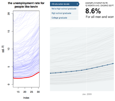
The Jobless Rate for People Like You
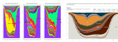
How Different Groups Spend Their Day
You consistently produce arresting and informative graphics about a range of topics. How do you decide on which topics to tackle?
News value and interestingness are probably the two most important criteria for deciding what to work on. In an ideal world, you get both, but sometimes, one is enough (or the best you can do).
Are your project choices motivated by availability of data?
Sure. The availability of data also affects the scope of many projects. For example, the guys who work on our live election results will probably map them by county, even though precinct-level results are so much better. But precinct-level data isn’t generally available in real time.
What is the typical turn-around time from idea to completed project?
The department is most proud of some of its one-day, breaking news work, but very little of that is what I would think of as data-heavy. The real answer to “how long does it take?” is “how long do we have?” Projects always find ways to expand to fill the available space, which often ranges from a couple of days to a couple of weeks.
Do you have any general principles for how you make complicated data understandable to the general public?
I’m a big believer in learning by example. If you annotate three points in a scatterplot, I’m probably good, even if I’m not super comfortable reading scatterplots. I also think the words in a graphic should highlight the relevant pattern, or an expert’s interpretation, and not merely say “Here is some data.” The annotation layer is critical, even in a newspaper (where the data is not usually super complicated).
What do you consider to be the most informative graphical elements or interactive features that you consistently use?
I like sliders, because there’s something about them that suggests story (beginning-middle-end), even if the thing you’re changing isn’t time. Using movement in a way that means something, like this or this, is still also fun, because it takes advantage of one of the ways the web is different from print.
30 May 2012
Spurred by Rafa’s post on evaluating statisticians working in genomics, there’s an interesting discussion going on at the Scientists for Reproducible Research group on statistics journals. Evan Johnson kicks it off:
…our statistics journals have little impact on how genomic data are analyzed. My group rarely looks to publish in statistics journals anymore because even IF we can get it published quickly, NO ONE will read it, so the only things we send there anymore are things that we don’t care if anyone ever uses.
Evan continues:
It’s crazy to me that all of our statistical journals are barely even noticed by bioinformaticians, computational biologists, and by people in genomics. Even worse, very few non-statisticians in genomics ever try to publish in our journals. Ultimately, this represents a major failure in the statistical discipline to be collectively influential on how genomic data are analyzed.
I may agree with the first point but I’m not sure I agree with second. Regarding the first, I think Karl put it best in that really the problem is that “the bulk of the people who might benefit from my method do not read the statistical literature”. For the second point, I think the issue is that the way science works is changing. Here’s my cartoon of how science worked in the “old days”, say, pre-computer era:
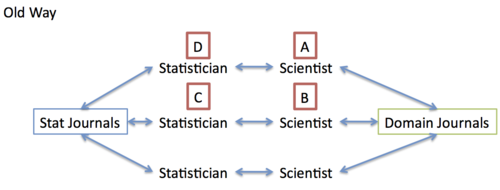
The idea here is that scientists worked with statisticians (they may have been one and the same) to publish stat papers and scientific papers. If Scientist A saw a paper in a domain journal written by Scientist B using a method developed by Statistician C, how could Scientist A apply that method? He had to talk to Statistician D, who would read that statistics literature and find Statistician C’s paper to learn about the method. The point is that there is no direct link from Scientist A to Statistician C except through statistics journals. Therefore, it was critical for Statistician C to publish in the stat journals to ensure that there would be an impact on scientists.
My cartoon of the “new way” of doing things is below.
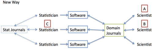
Now, if Scientist wants to use a method developed by Statistician C (and used by Scientist B), he simply finds the software developed by Statistician C and applies it to his data. Here, there is a direct connection between A and C through software. If Statistician C wants his method to have an impact on scientists, there are two options: publish in stat journals and hope that the method filters through other statisticians, or publish in domain journals with software so that other scientists may apply the method directly. It seems the latter approach is more popular in some areas.
Peter Diggle makes an important point about generalized linear models and the seminal book written by McCullagh and Nelder:
the book [by McCullagh and Nelder] would have been read by many fewer people if Nelder and colleague had not embedded the idea in software that (for the time) was innovative in being interactive rather than batch-oriented.
For better or for worse (and probably very often for worse), the software allowed many many people access to the methods.
The supposed attraction of publishing a statistical method in a statistics journal like JASA or JRSS-B is that the methods are published in a more abstract manner (usually using mathematical symbols) in the hopes that the methods will be applicable to a wide array of problems, not just the problem for which it was developed. Of course, the flip side of this argument is, as Karl says, again eloquently, “if you don’t get down to the specifics of a particular data set, then you haven’t really solved any problem”.
I think abstraction is important and we need to continue publishing those kinds of ideas. However, I think there is one key point that the statistics community has had difficulty grasping, which is that software represents an important form of abstraction, if not the most important form. Anyone who has written software knows that there are many approaches to implementing your method in software and various levels of abstraction one can use. The variety of problems to which the software can be applied depends on how general the interface to your software is. This is why I always encourage people to write R packages because it often forces them to think a bit more abstractly about who might be using the software.
Whither the statistics journals? It’s hard to say. Having them publish more software probably won’t help as the audience remains the same. I’m a bit stumped here but I look forward to continued discussion!
28 May 2012
This is yet another outstanding post by Paul Graham, this time on “Schlep Blindness”. He talks about how there are great startup ideas that no one considers because they are too much of a “schlep” (a tedious unpleasant task). He talks about how most founders of startups want to put up a clever bit of code they wrote and just watch the money flow in. But of course it doesn’t work like that, you need to advertise, interact with customers, raise money, go out and promote your work, fix bugs at 3am, etc.
In academia there is a similar tendency to avoid projects that involve a big schlep. For example, it is relatively straightforward to develop a mathematical model, work out the parameter estimates, and write a paper. But it is a big schlep to then write fast code that implements that method, debug the code, dummy proof the code, fix bugs submitted by users, etc. Rafa’s post, Hadley’s interview, and the discussion Rafa linked to all allude to this issue. Particularly the fact that the schlep, the long slow slog of going through a new data type or writing a piece of usable software is somewhat undervalued.
I think part of the problem is our academic culture and heritage, which has traditionally put a very high premium on being clever and a relatively low premium on being willing to go through the schlep. As applied statistics touches more areas and the number of users of statistical software and ideas grows, the schlep becomes just as important as the clever idea. If you aren’t willing to put in the time to code your methods up and make them accessible to other investigators, then who will be?
To bring this back to the discussion inspired by Rafa’s post, I wonder if applied statistics journals could increase their impact, encourage more readership from scientific folks, and support a broader range of applied statisticians if there was a re-weighting of the importance of cleverness and schlep? As Paul points out:
In addition to their intrinsic value, they’re like undervalued stocks in the sense that there’s less demand for them among founders. If you pick an ambitious idea, you’ll have less competition, because everyone else will have been frightened off by the challenges involved.
 Follow us on twitter